
How do the Mysterious MOMO Meters Work?

We get asked from time to time what the meters on the top of MOMO represent. And while we do describe it in the help section of the (yes, there is help and its under settings!) I thought I would also describe what they do here.
As you may have guessed they are a general gauge of market momentum and they can be very useful. First, let’s take a look at the MOMO meters themselves.
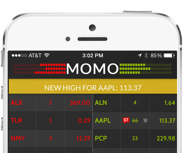
If you look at the meters you will see three rows to either side of the MOMO logo. Each row represents a different index. Dow is the top row, Nasdaq is the middle row, and the S&P 500 is the bottom. For each row as the ratio of new higher breakouts to lower breakouts changes the meters react proportionately.
The meters are calculated based on 2.5 minute rolling average. As an example, if out of all stocks making either new highs or lows in that 2.5 minute window, the Nasdaq (middle row) has 80% of those stocks reaching new highs, the middle row of the MOMO meters will be 80% green and 20% red.
During times of a strong sell-off or spike, it not unusall for all of the MOMO meters to be solid red or green. Throughout the course of the day, it is also not unusual to see less activity on the meters as it becomes increasingly unlikely stocks will be able to continue to break out. This is especially true with the Dow for obvious reasons.
Still need to upgrade MOMO for iOS 9?
Get it here: MOMO in the App Store