
The 30-second guide to using MOMO.

We’ve had a couple visitors recently ask how MOMO works. And while we tried to make it intuitive, we are taking a moment to give you the 30-second MOMO training guide. Right here, right now.
There are two columns in MOMO. A red and a green. The green one is showing real-time price action for all the stocks making new daily highs. As you may imagine, the red one is doing the oppposite and showing the new daily lows.
This means for every stock that is listed in the green column you are viewing the "higher-high" for that stock. For example, if Apple is listed (AAPL) with a price of 127.00, that tells you that AAPL has not traded higher than 127.00 for the day. The next time AAPL will be listed in the green column during that day is if the price breaks 127.00; whether 127.01 or anything higher.
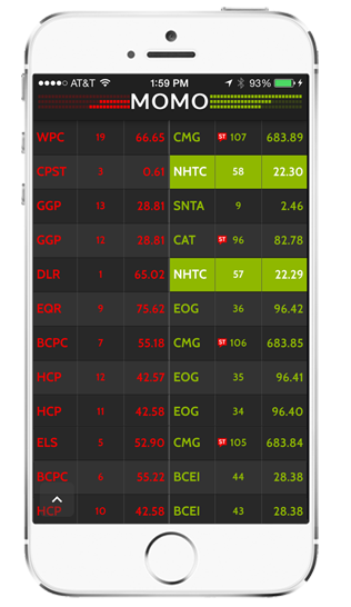
The opposite is true for the red column. AAPL will be listed in the red column when the stock is trading down to "lower-lows". If AAPL opens at 121.00 and drops to 120.97, then to 120.82, both the sub-121.00 trades would be shown in MOMO's left column.
Lastly, as the image shows with symbol NHTC, if the stock is breaking a 52-week high or low, we highlight the cell in solid red or green.
Hopefully, by now you are starting to grasp the potential of MOMO. Keep in mind we do this for over 6500 stocks across Nasdaq, S&P 500, and Dow. Stay tuned for more posts on how to use MOMO's features.